May 10, 2026
What I learned rebuilding my website three times
This website has been rebuilt three times. Each version reflected what I thought I was supposed to be: academic, then learner, then entrepreneur. This post is about what I’d recommend to anyone building one.
A personal website acts as a portfolio for a researcher, and the more you publish, the more it’s desirable to have one. Yes, your publications are listed in Google Scholar, but with a website, you present this information your way. The teaser image does heavy lifting, and once you start getting publications, I’d even recommend that you pick the ones you want to highlight. My most cited work is a geometry processing paper and appears first on Google Scholar, but it’s not exactly what I’m working on anymore. You can also add tags and a filter function.
Now that you want to create an academic website, how do you do it? I had no clue at the time, so I just copied what was in fashion with my peer Ph.D. students. They were using Wowchemy’s academic template (now renamed HugoBlox), which is based on Hugo. If you know nothing about web programming and want to have a website quickly, absolutely use that first. You’ll have the luxury to change it later anyway, but it’ll get you running very fast. And the fact that your website looks like everyone else’s is NOT an issue. Jakob’s Law says that “Users spend most of their time on other sites. This means that users prefer your site to work the same way as all the other sites they already know.”
Because of the rising popularity of Three.js, I got a little bit more into web development. I read Learning Web Design by Jennifer Robbins. It’s a nice read, but a long one, and probably not the most efficient way to learn. It covers HTML/CSS/basic Javascript, and with that in mind, I did my second version of the website. No fancy framework, just plain web languages. I wouldn’t necessarily recommend it, though. Except if learning how browsers work with flexgrid and media queries is of interest to you. But you likely have more interesting stuff on your plate.
Things changed rather toward the end of my Ph.D., when I decided to go through the entrepreneurship path. I made a website for my prototype company, which required a backend and frontend that displayed information accordingly. I also wanted to simply glance at modern web tech, so I naturally landed on React. I remade my academic website using React, TypeScript, and Tailwind CSS. React is built on the idea of providing reusable components, which is useful because you can write some code for displaying a “publication” item and iterate over the same component to display them all. Built with Vite, and deployed via gh-page. It was the same website, with the same functionalities. Just more complex, and actually, slightly worse because the website was merely returning a <script> tag within which the whole page was rendered. That’s called client-side rendering: it’s JavaScript that hydrates the content in the browser, not plain HTML/CSS. The problem? Crawlers and search engines could not analyze the content of my website, they just saw a <script> tag. For SEO, it’s less than optimal, which means that people will find you less easily. This is solved by frameworks like Next.js that provide server-side rendering, which Boldbobbin uses. Honestly, that’s overkill for a static website.
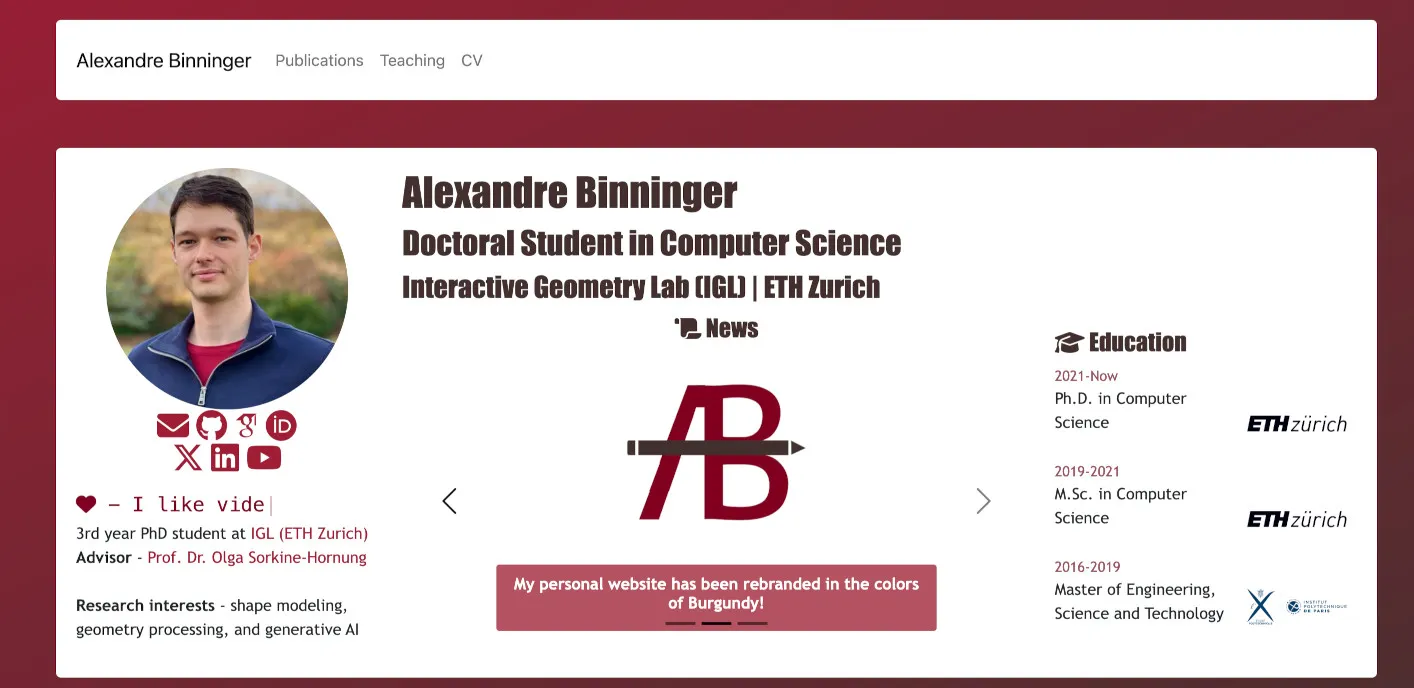
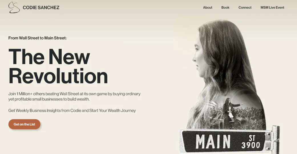
The last revamp of this website was not merely technical; I wanted to change what it conveys about me, as the founder of Boldbobbin. New problem: I had no clue how to build a “founder website”. I just took one that I liked as a reference. The one I kept in mind was Codie Sanchez’s (I have no idea what she sells, I just like the design).
I saw her post on YouTube, went to the website, and really liked her Hero section. So I put my picture on the right, with my mission on the left. I added some dynamic effects (I’m a computer graphics person, I need my dose of Bezier curves). Because it was still a bit empty, I added the news section there. Not sure about that one, we’ll see. I might also add a CTA to a newsletter later on. Just below is what I’m building, then a curated list of publications, and it ends with a contact form. The contact form uses a worker deployed on Cloudflare. I used to just put my email address, but this is not a good idea; you will get spammed.
On the technical side, I ditched my previous configuration to integrate Astro. It’s easier and integrates nicely with React components. It’s as easy as it gets:
<ul class="publications-page-list">
  {publications.map((pub, index) => (
    <Publication publication={pub} idx={index} />
  ))}
</ul>
I’d absolutely recommend it for your academic website. It’s meant for content creation, which publication pages are to a certain degree. And you are not limited by the framework in the future. By default, Astro:
- Renders components to HTML at build time
- Ships the resulting HTML directly (for example, my “About” page is a real
.htmlfile) - Ships zero JavaScript unless you explicitly opt in for a specific component (via
client:load).
This is called islands architecture: your page is mostly static HTML, with optional interactive “islands” of JS where you actually need them. The rest of the page is plain HTML.
In the end, these are my recommendations if you’re building your own academic website:
- Use Hugo + HugoBlox for the v1.
- Don’t do manual HTML/CSS/JS or React+Vite, except if you want to learn them for some reason. React is a useful tool to have under your belt.
- Use Astro if you want the flexibility of React and a website that drives traffic.
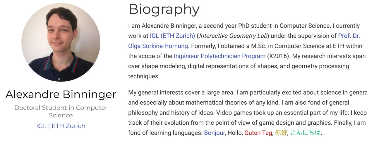
I also added an About page. I took inspiration here from a different source: Shaohui Liu, a CS PhD from ETH and a friend. One line on his About page stuck with me: “I keep reading, thinking and working hard every day, but I think sincerity makes me a truly human.” It’s direct, a little unguarded, and it made him more likeable to me as a reader.
So I wrote my own About page with that in mind. Not a list of accomplishments to brag, there’s enough of that on the internet, but how I actually felt about the things I did, and what lesson I took from them. If a personal website is a portfolio, the About page is the part where the human behind the portfolio shows up.